1. 数据集介绍
本章节需要用到mpg数据集。
It includes information about the fuel economy of popular car models in 1999 and 2008, collected by the US Environmental Protection Agency, http://fueleconomy.gov. – ggplot2: Elegant Graphics for Data Analysis
简单查看一下数据集的内容:
|
|
查看更具体的信息:
|
|
各变量解释如下:
- cty and hwy record miles per gallon (mpg) for city and highway driving. (城市和高速油耗)
- displ is the engine displacement in litres. (排量)
- drv is the drivetrain: front wheel (f), rear wheel (r) or four wheel (4). (驱动方式)
- model is the model of car. There are 38 models, selected because they had a new edition every year between 1999 and 2008. (车型)
- class is a categorical variable describing the “type” of car: two seater, SUV, compact, etc. (车辆类型)
更多查看数据集信息的函数包括:
- **help():**查看数据集文档。
- **summary():**查看各变量的总体信息。
- **dim():**查看数据集维度。
- **glimpse():**dplyr 包提供的类似str()的函数。
如果想要查看ggplot2更多的数据集,可以使用
|
|
2. 图表绘制
2.1 ggplot2关键元素
所有使用ggplot2绘制的图表都包含以下三个元素:
- 数据。
- 一组数据中的变量和视觉属性之间的美学映射。
- 至少一层描述如何渲染数据的layer,通常由geom函数创建。
2.2 开始绘制
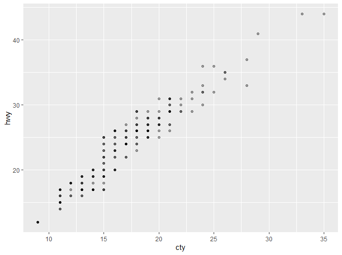
首先绘制一个简单的散点图。
|
|
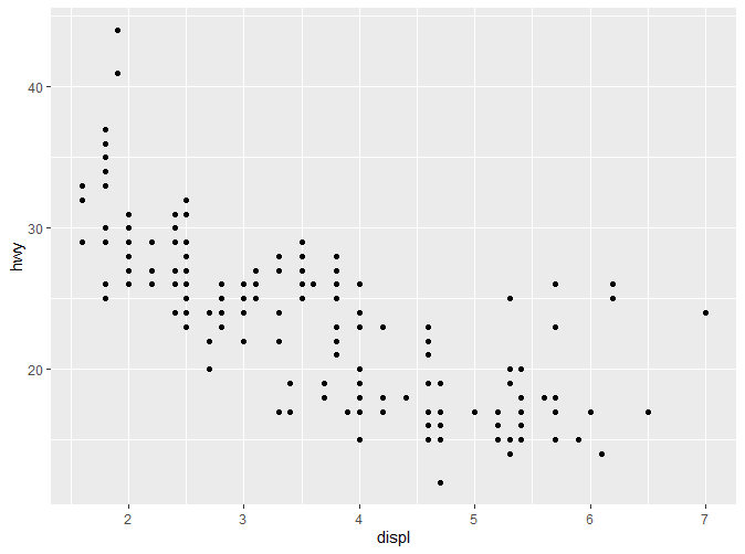
通过以上代码我们可以看到,mpg数据集作为数据,排量以及高速油耗分别被映射到X和Y轴,散点作为layer。 以上代码揭示了ggplot2的一种模式:数据和映射作为ggplot()的参数,而layer以“+”进行连接。 注意ggplot函数与geom_point函数并不在同一行,这并非是语法要求,而是为了能更清楚地了解作图的结构,例如我们可以在此基础上再加一层。
|
|
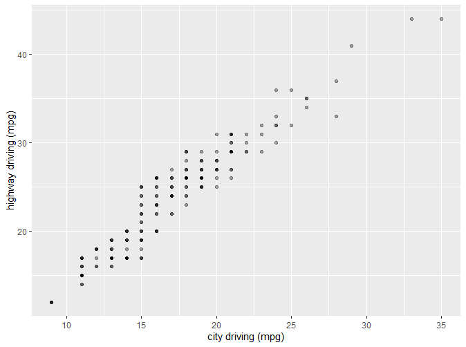
2.3 更多美学元素
通过查看文档,我们能了解**aes()**更多的参数:
可以看到,除了x,y以外,aes还支持其他参数。
2.3.1 Color, Shape
先看以下代码生成的图表:
|
|
|
|
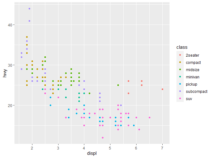
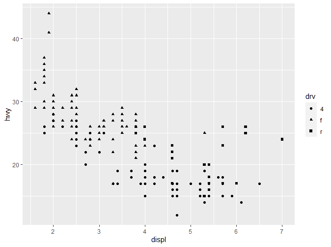
在这里我们分别通过color(也可以写作colour)和shape指定了颜色与形状两个特征。在图形右侧均出现了图例。通过不同的颜色或者形状,我们能非常清晰的了解各类别数据的分布。 如果我们只想要固定的颜色怎么办?请看以下代码:
|
|
|
|
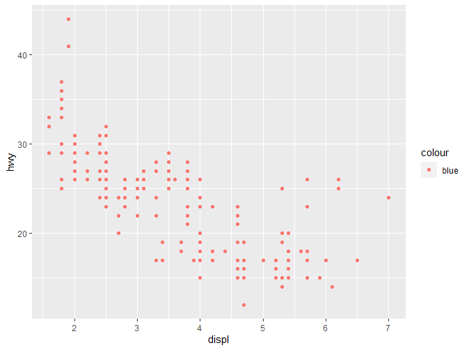
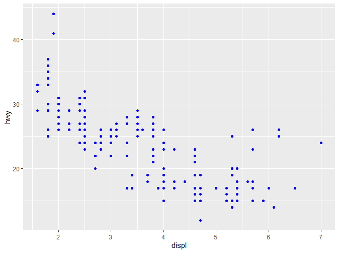
我们可以发现一个诡异的现象,在第一段代码中,我们明明选择的颜色是蓝色,但是最终呈现却是粉红色。而第二段代码中我们去掉了aes函数,最终呈现的颜色是正确的,但是图例却没有了。对于这个现象的解释,后续会提到。更多关于颜色和形状的信息可以参考https://ggplot2.tidyverse.org/articles/ggplot2-specs.html
注意,颜色和形状一般适用于分类变量 (categorical variables),如果应用于连续变量,ggplot2会给出警告,同时绘制出的图形可读性也会大大降低。
2.3.2 Size
同样看一段代码:
|
|
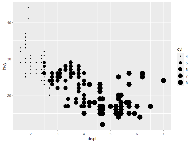
Size通过大小对数据进行区分,这里我们以气缸数来确定大小,可以看到,一般来说,气缸数小,油耗也相应较低;小排量的汽车一般气缸数也较小。
2.4 Faceting
正如之前提到的,faceting可以分为三类:null,wrap以及grid。 Wrap是最为有用的一种。以下代码展示了wrap的绘制。
|
|
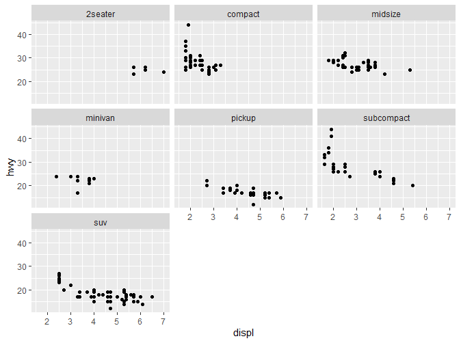
可以看到,原有的图表根据Class被分为了7个子图表。要绘制Wrap,只需要简单的在分类变量之前添加“~”。
2.5 选择更多图层
前面的绘图我们主要使用了**geom_point()**来绘制散点图。ggplot2支持许多的图层,后续会有更加详细的介绍。这里先介绍一些常见的图层。
2.5.1 Smooth
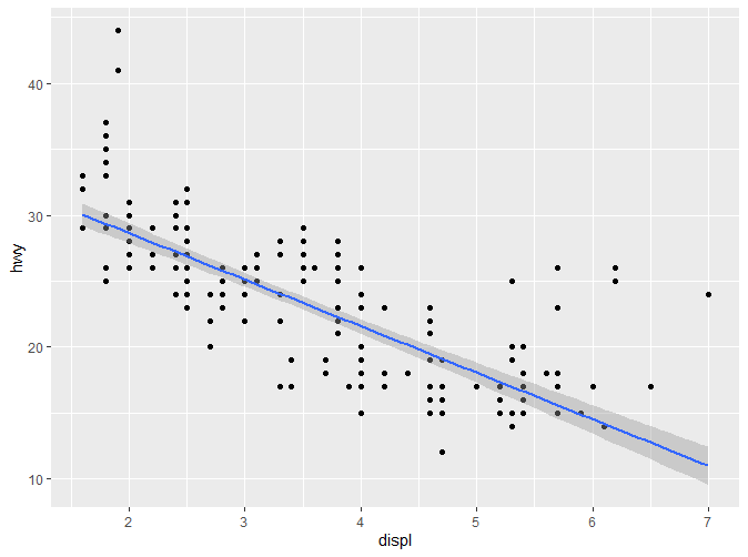
还是先上代码:
|
|
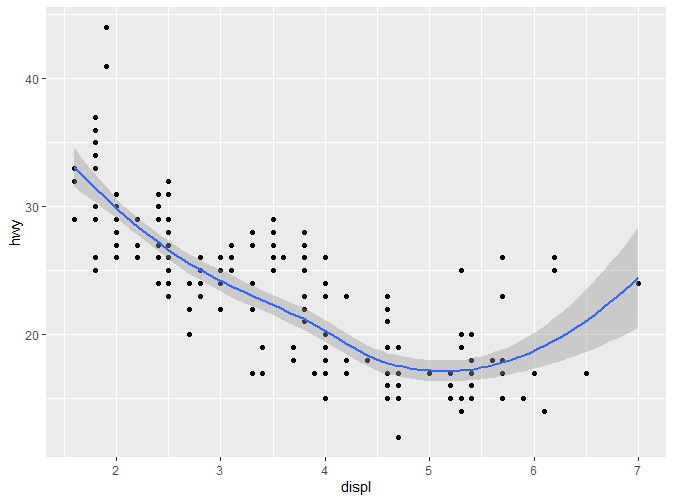
可以看到,在原有的图层之上,又增加了一条光滑的曲线。灰色部分代表置信区间。如果不想要展示置信区间,可以通过geom_smooth(se=FALSE)关闭。如果想要调整曲线的摆动程度,可以通过指定span参数(0-1),span值越大摆动程度越小。 如提示信息所示,在不增加其他参数的情况下,geom_smooth()默认的两个参数分别是method=‘loess’和formula=y~x。接下来我们会简单介绍更多的method。
2.5.1.1 method=“loess”
geom_smooth()默认的方法,一般适用于较小的样本。该方法包含于stats包中,用于局部多项式回归。通过查阅文档可以了解到更具体的原理:
Fitting is done locally. That is, for the fit at point x, the fit is made using points in a neighbourhood of x, weighted by their distance from x (with differences in ‘parametric’ variables being ignored when computing the distance). The size of the neighbourhood is controlled by α (set by span or enp.target). For α < 1, the neighbourhood includes proportion α of the points, and these have tricubic weighting (proportional to (1 - (dist/maxdist)^3)^3). For α > 1, all points are used, with the ‘maximum distance’ assumed to be α^(1/p) times the actual maximum distance for p explanatory variables.
For the default family, fitting is by (weighted) least squares. For family=“symmetric” a few iterations of an M-estimation procedure with Tukey’s biweight are used. Be aware that as the initial value is the least-squares fit, this need not be a very resistant fit.
It can be important to tune the control list to achieve acceptable speed. See loess.control for details.
该方法不适合用于样本大于1000的数据集。
2.5.1.2 method=“gam”
gam包含于mgcv包中,使用前需要先加载mgcv。gam实现了广义相加模型,需要提供formula,例如formula=y~s(x)或者formula=y~s(x,bs=“cs”) (对于大型数据集)。
|
|
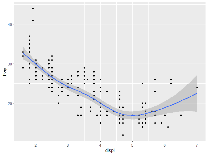
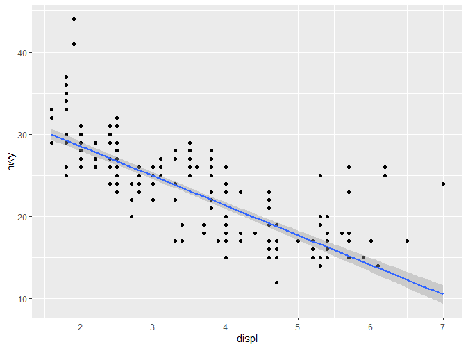
2.5.1.3 method=“lm”
顾名思义,**“lm”**指的是线性模型。
|
|
2.5.1.4 method=“rlm”
更加健壮的线性回归,较少受到离群值的影响。该方法包含于MASS包中,使用前需要先加载改包。
|
|
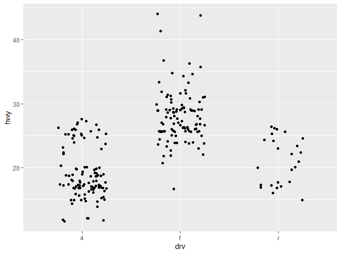
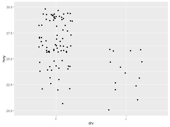
2.5.2 箱线图(boxplot)和扰动点(jittered points)
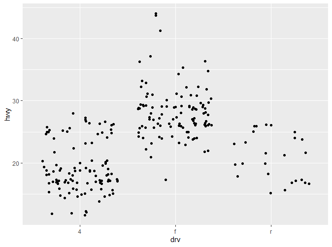
如果我们想要了解一组连续数据在各分类变量上的变化,我们可能会这么做:
|
|
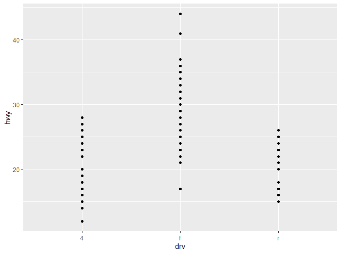
这张图展示了高速油耗在不同驱动模式下的分布变化。可以看到,各个观察值之间的距离还是相对较为紧凑,如果数据量更大,尺度更加细腻,难免会出现重叠(Overplotting)的情况。因此我们可以通过箱线图(boxplot),增加部分扰动点(jittered points)或者小提琴图来展现(violinplot)。
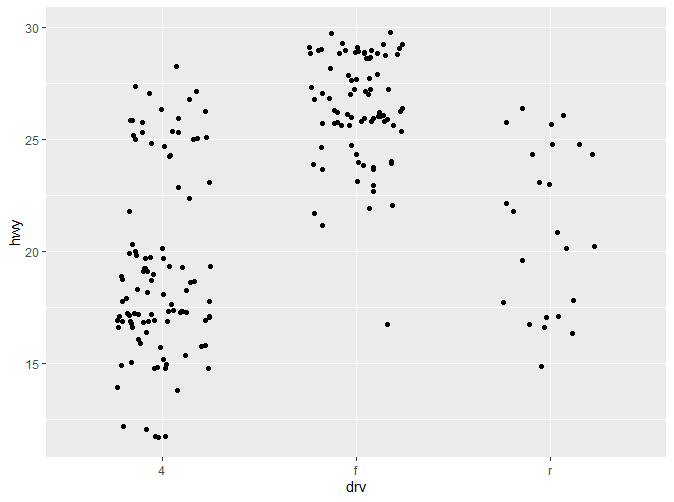
|
|
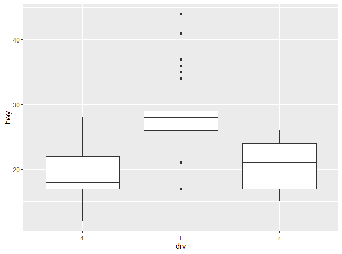
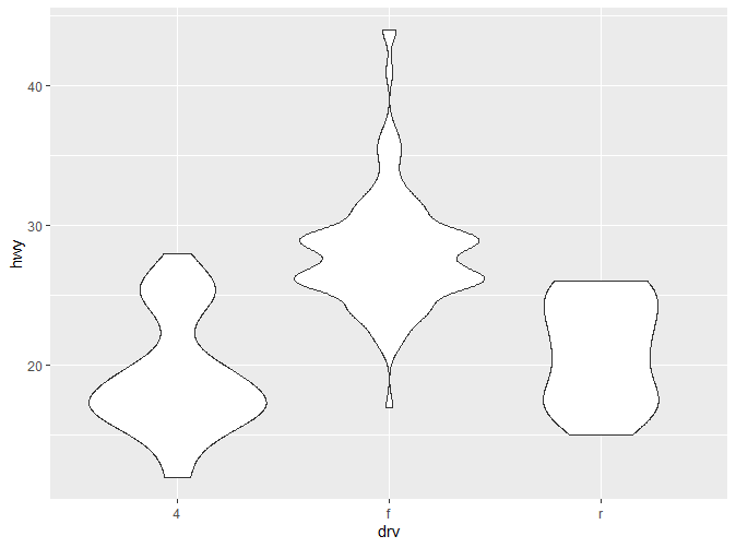
这三种图各有各自的优缺点:
- **Box Plot:**能直观的了解到数据整体的分布(中位数,四分位数,边缘,离群值)。但只提供5个统计数据。
- **Jittered Points:**随即增加一些扰动点,避免数据过多的重叠。但只适合用于较小的数据集。
- **Violin Plot:**小提琴图提供了最丰富的数据,相较于箱线图,展现了数据分布的密度,但因为依赖于密度估计(KDE),同时更难解释。
- 关于这三个函数更多的参数及用法,请参考文档?geom_jitter, ?geom_boxplot, ?geom_violin。
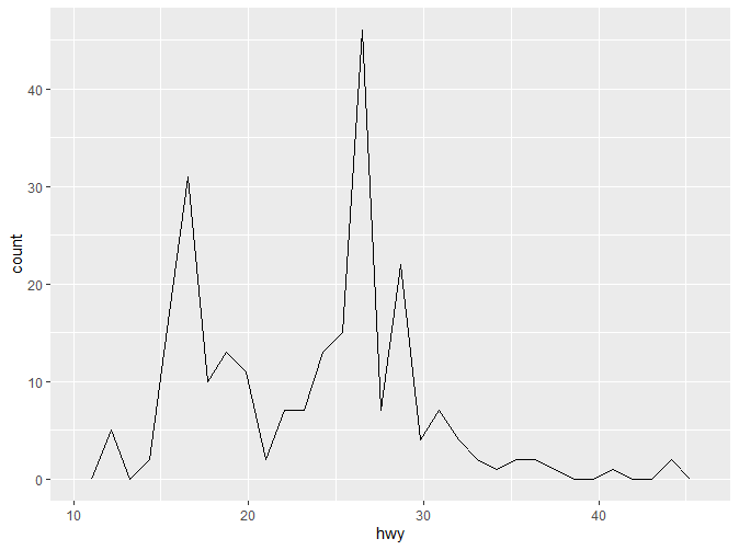
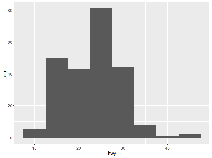
2.5.3 直方图(Histograms)和频数多边形(Frequency Polygons)
直方图与频数多边形图都是常用的图形。它们都反映了一个数值变量的分布情况。它们的原理是相近的:它们都引入了组距的概念(binwidth),不同的是频数多边形去每组中点对应的值,然后连接各点。下面是实现代码:
|
|
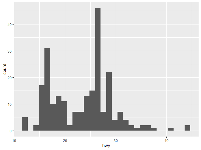
可以看到默认的组距是30。要记住,一个好的组距对于数据的展示很重要,需要反复实验以得到一个好的组距。我们可以通过binwidth来改变组距。
|
|
如果我们想了解不同分类变量下改数值变量的分布情况,有两种方式:
|
|
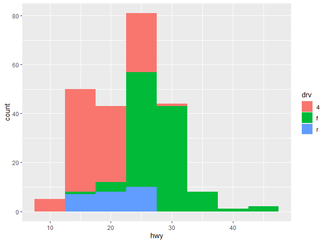
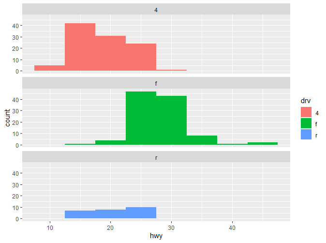
可以看到,使用facet_wrap能让我们更直观的看到各类别的分布。
2.5.4 条形图(bar charts)
条形图也是较为常用的一类图表。主要用于离散的变量。条形图的绘制非常简单:
|
|
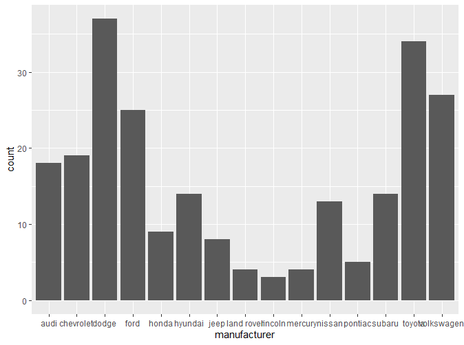
可以看到有一部分标签因为距离关系出现了重叠,这个问题将在之后的章节解决。
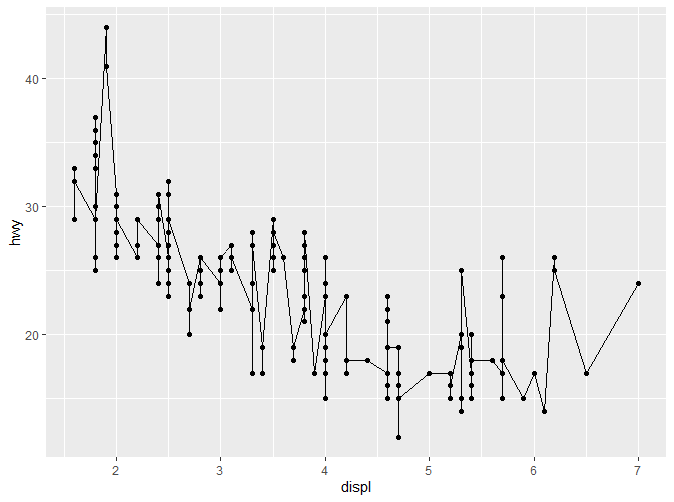
2.5.5 时间序列的线图(Line Plot)和路径图(Path Plot)
线图和路径图是时间序列分析中常用的两类图表。如何来理解和区分这两种图表?根据书中的说法:
Line plots join the points from left to right, while path plots join them in the order that they appear in the dataset (in other words, a line plot is a path plot of the data sorted by x value). Line plots usually have time on the x-axis, showing how a single variable has changed over time. Path plots show how two variables have simultaneously changed over time, with time encoded in the way that observations are connected. – Elegant Graphics for Data Analysis
线图是按照一定顺序从左到右连接所有观察点得到的,而路径图则是按照观察点出现在数据集中的顺序得到的。这段话还是十分绕口,所以我们先来看一个例子:
|
|
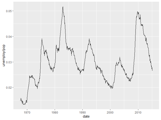
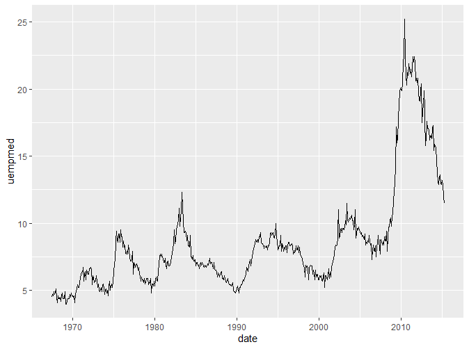
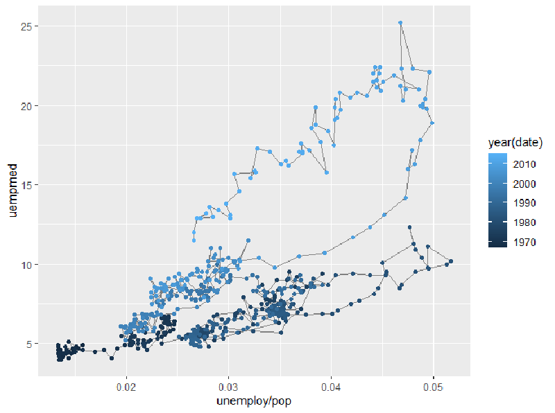
我们引入了一个新的数据集economics。该数据集包含了美国40年间的经济数据。以上两张图用线图绘制了人口中失业率与年份的关系以及失业周数的中位数与年份的关系。通过两张图我们可以看到,线图的横坐标往往是时间,展现了Y轴变量随时间变化的趋势。如果我们想要了解人口失业率与失业周数的关系怎么办?我们可以把这两个变量放在一张图上作为两个坐标轴作散点图,但是这样而来就无法观察到它们随时间的变化。所以这个时候我们就引入了路径图。
|
|
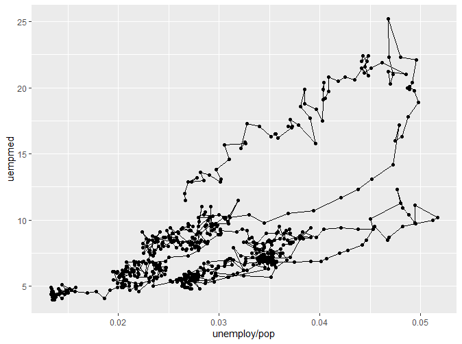
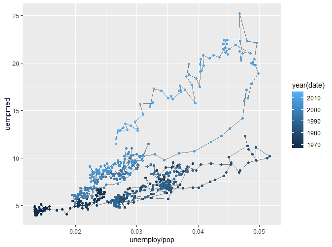
我们可以看到,我们将数据点通过路径连接起来,形成了路径图。但是第一幅图并不能直观看出变化与时间的关系,于是我们通过颜色将不同的时间分类,得到了更为直观的第二幅图。
2.6 修改坐标轴
尽管之后的章节会对这个话题有更深入的讲解,但我们可以先看几个简单使用的例子。
|
|
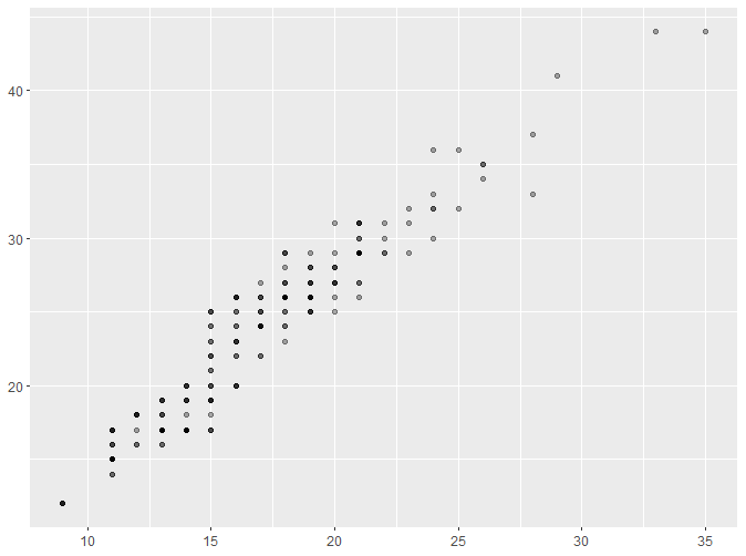
这里新出现了一个参数alpha。alpha是scale的一种,将在后续介绍。通过以上的例子,我们可以直观地了解到如何对坐标轴标题进行修改。 我们还可以通过以下例子了解到如何修改坐标轴范围:
|
|
更多详细信息将在后续章节说明。
2.7 输出
除了直接绘图之外,我们也可以将绘制赋予一个对象:
|
|
以上代码将ggplot2的绘制赋予了变量p,通过变量p我们可以进行一系列操作,以下将展示几个最基本的操作,更多内容将在后续章节介绍。
|
|
欢迎关注我的公众号和小红书呀~
| 微信公众号 | 小红书 |
|---|---|
 |
 |